healthcare
/
Product Design
PreviMedica
A healthcare portal redesigned end to end for different user roles

Overview
Analyzing what existed and surfacing the friction points that mattered
About the client
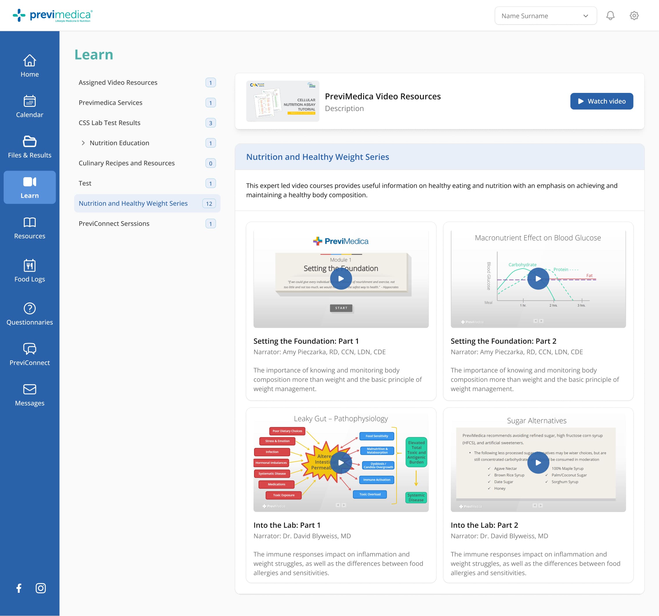
PreviMedica is a US-based lifestyle medicine platform that connects patients with specialized practitioners around personalized nutrition — based on functional lab tests. Their patient portal centralizes consultations, lab results, nutrition plans, and daily tracking for three user types: patients, providers, and admins.

Friction points
The home screen added no value
Quick-access buttons duplicated the sidebar. No summary of what actually mattered.
PROBLEM 1
Wrong information at the top of the calendar
Doctor bio cards dominated the screen. Upcoming appointments required scrolling through months.
problem 2
Data tables built for the system, not the user
Across all flows, tables showed too much information in the wrong order: technical labels, unclear actions, and inconsistent visual hierarchy.
problem 3
Project scope
Review all patient and provider flows end to end, from information architecture through final UI. The component library and design system were built from scratch. Edge cases and empty states were mapped for every section. The admin role is currently in progress.
Process
Three key improvements that shaped the redesign, each with rationale and before/after.
Home: from shortcut list to command center
The question: what does a user actually need when they open this app? Replaced duplicated quick-access buttons with a real dashboard — upcoming consultations, pending tasks, new resources, additional services. News feed moved to the bottom. Provider home follows the same logic, more compact.
Home - Patient view (before)

Home - Provider view (after)

Calendar: hierarchy follows task priority
The question: why is a patient scrolling through a monthly grid to find their next appointment? Moved upcoming consultations to the top as scannable status cards. Doctor bios moved to a compact section at the bottom. Scheduling modals reduced from 5 actions to essentials. No-show edge case defined and mapped.
Calendar - Patient view (before)

Calendar - Patient view (after)

Patients list: from two tables to one clear view
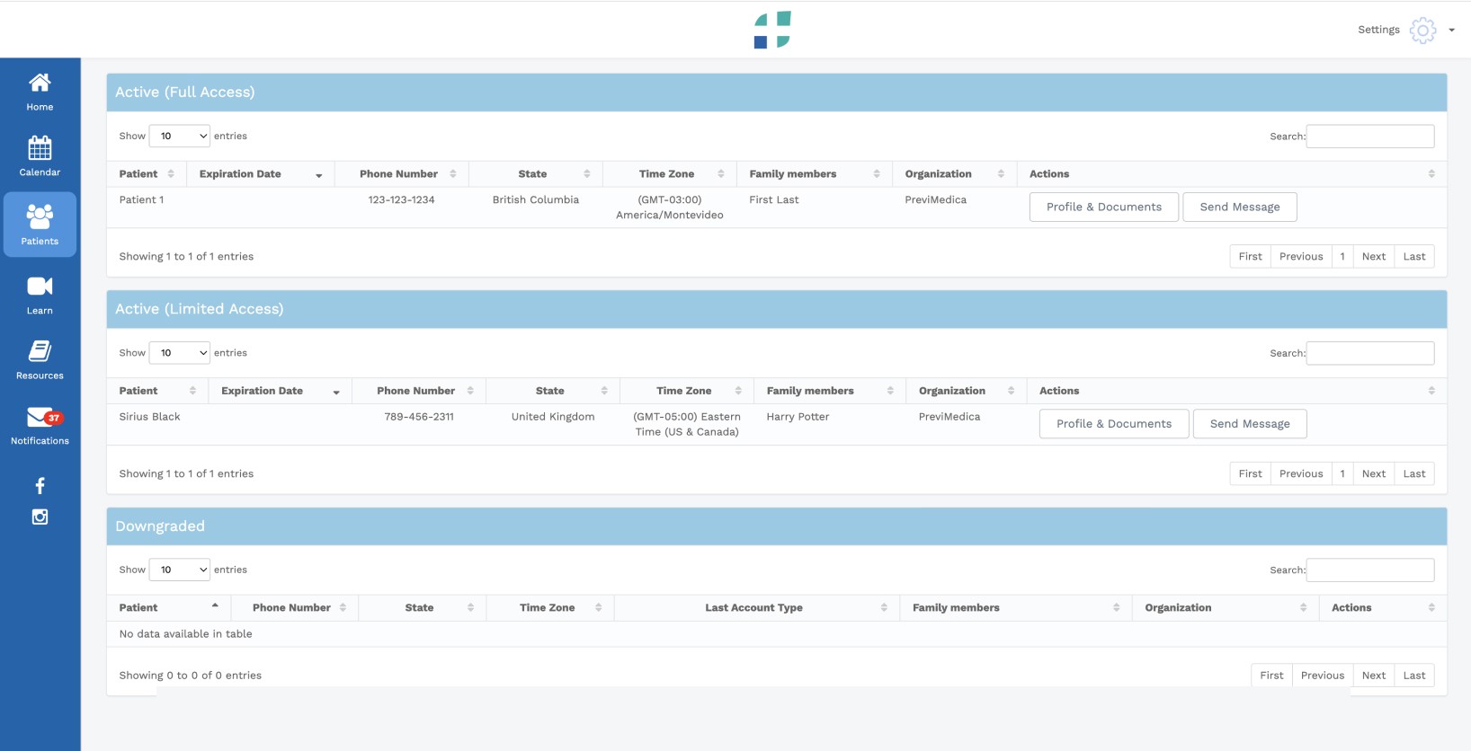
Across all flows, data tables were showing too much — in the wrong order, with technical labels and unclear actions. The Patients list is where all of that came together: columns restructured to surface only what matters at a glance, Full Access and Limited Access merged into a single list with an Account Type column, filters added by organization and account type. The same decisions were applied to every table in the platform
Patients - Provider view (before)
Patients - Provider view (after)

Outcome
Every screen delivered, built on a single design system.