healthcare
/
Product Design
LifeBridge Health
Redesigning the patient journey for a US-based healthcare provider
SCOPE
Product Discovery
Mobile App Design
Interactive Prototype
ROLE
Product Designer
Client
PERIOD
Oct - Dec 2024

Overview
A full discovery and design engagement to understand why patients weren't using an existing portal, and redesign the core experience to change that.
About the client
LifeBridge Health operates across Maryland with over one million annual patient touchpoints.
Their portal brought together multiple systems for scheduling, payments, messaging, and referrals, each built independently with its own logic.
The problem
Their portal had scheduling, check-in, and provider messaging, but most patients were still calling to book. The goal was to understand why, redesign the core flows, and give the team a clear path to increase online bookings by 30%.
The challenge
We ran a full discovery and design sprint: mapping the current state of the portal, understanding why patients weren't using it, and delivering a validated design direction ready for development.
Research
We conducted two moderated focus groups and a survey with 594 patients.
Survey results
65%
of patients scheduled by phone or in person
54%
cited repetitive data entry as a reason to call instead
71%
said they didn't trust online confirmation as much as a phone call
User journey map

End-to-end patient journey across pre-visit, visit day, and post-visit phases.
Key insights
Most patients didn't know they could book online.
The portal had full scheduling functionality. Patients just hadn't been told. The first barrier wasn't UX, it was awareness.
Repetition killed the flow.
Patients had to re-enter the same information at multiple steps of the same booking. Every extra field was a reason to call instead.
No confirmation meant no trust.
People weren't abandoning the flow because it was hard. Submitting a form just didn't feel like actually locking in an appointment
Appointment scheduling userflow

Two entry paths: search by provider or by practice location.
Design
With research complete, the design phase focused on one goal: making a fragmented system feel like a single, coherent product.
Design decisions
Design for one experience, not one system
The underlying architecture had multiple tools. Patients shouldn't feel that. Every handoff was designed to be invisible: consistent patterns, shared language, no dead ends.
Use what the system already knows
Insurance details, provider history, and communication preferences already existed across the portal but weren't being used. We mapped what each system held and designed flows that pre-filled wherever possible.
Make every step feel final
Trust wasn't a branding problem, it was a feedback problem. We added explicit confirmation states at every key action so patients knew something had actually happened, not just been submitted.
UI Kit

Color palette, typography, and core components used across the mobile app.
Booking system

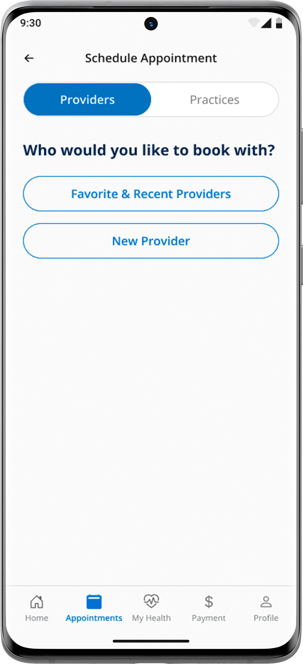


Full booking flow, from home to confirmed appointment and provider messaging.
Account & Communication

Supporting flows covering sign-in, communication preferences, saved providers, and profile management.
Solution
Designed a unified experience layer over an existing ecosystem, so patients would navigate one product, not seven.
Results
Validated Figma prototype covering all three core flows: Find a Doctor, Scheduling, and Check-In
Full patient journey map across pre-visit, visit day, and post-visit phases
Technical recommendations report, prioritized for the development team
Stakeholder alignment across four departments before handoff