Financial Analytics
/
Product Design
ie-Pulse
Turning complex financial datasets into decision-ready intelligence

Overview
I led the UX/UI design end to end, and worked as a business analyst during discovery
About the client
Tenoris3 is a Montreal financial-data company. ie-Pulse builds financial indices from aggregated accounting data of thousands of Canadian SMEs, organized by NAICS industry sector and region, and sold on subscription.
The challenge
The client came with a working analytics engine and a technical demo built to prove the concept. It was dense and hard to read: long filter panels, crowded charts, no clear hierarchy. My job was to turn that demo into a product people could understand, navigate, and pay for.
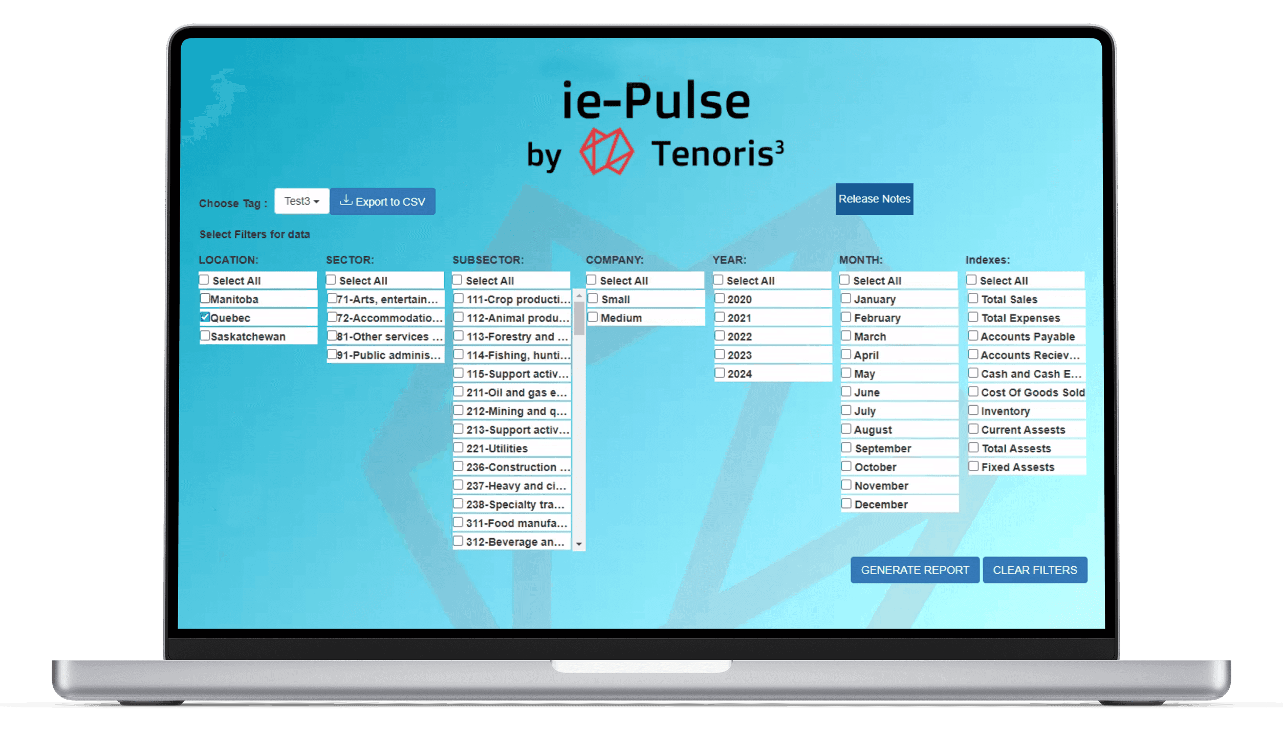
Client's technical demo.
Key design decisions
The objective was to move from “data panel” to a financial intelligence interface
Structure before screens
The client arrived with a rough demo and shifting requirements, so the first problem was defining what the product even was. I mapped the full architecture across logged-out, subscriber, and admin states, and detailed the subscription and payment logic down to its edge cases, before designing a single screen.

Sitemap used to lock scope before any screen was designed
2. Turning index selection into a guided choice
Subscribing meant choosing from hundreds of possible indices, which in the early flow felt like data entry. I split the offering into standard plans, which are curated index sets, and custom plans, then designed the selection as progressive steps from location to sector to subsector to account, with reference fact sheets inline so users could decide with context in front of them.


A dashboard that reads at a glance
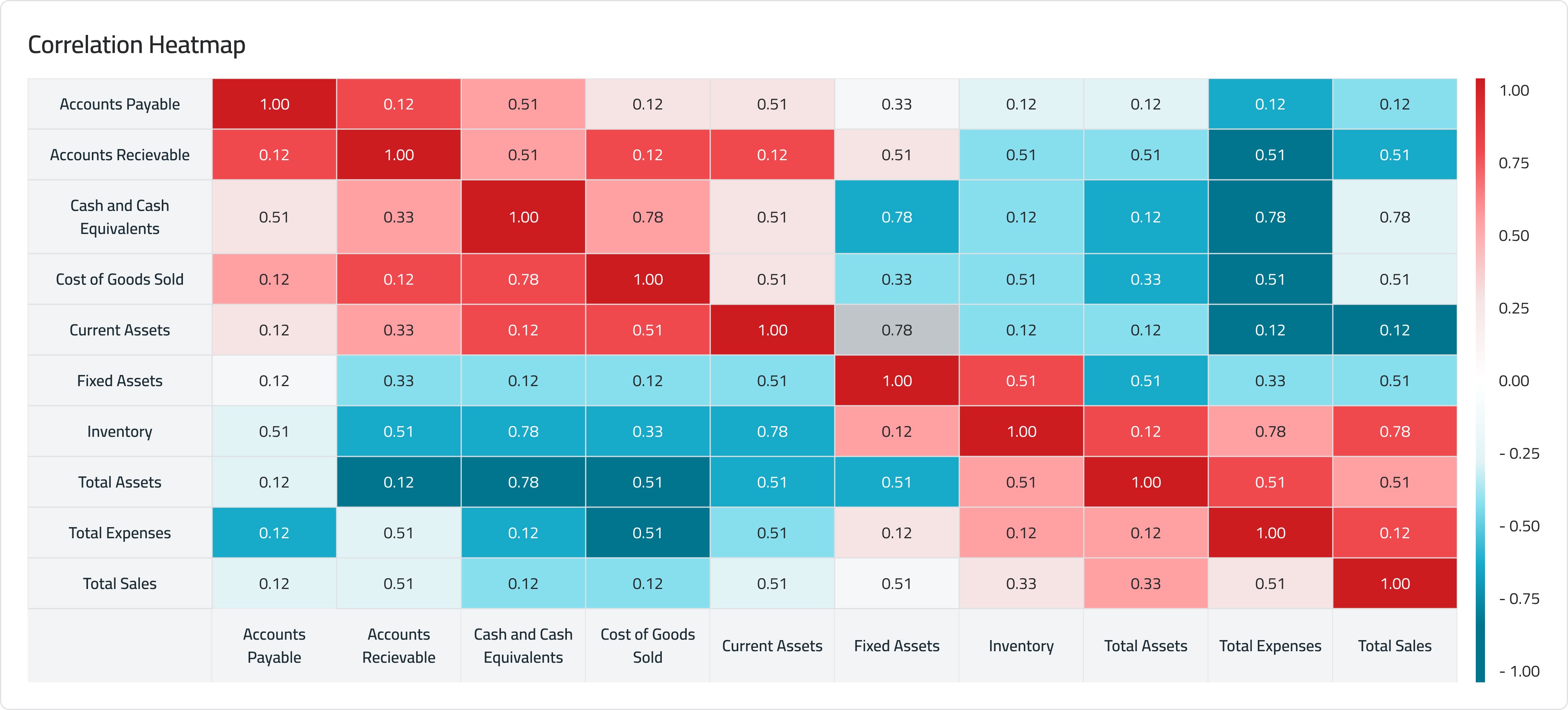
Financial users decide on movement and momentum, not raw tables. I surfaced the most decision-relevant signals first: a real-time ticker, pace indicators, trend, and correlations. The ticker mirrors the one on Tenoris3's own product, keeping the experience continuous with their brand.



Design system & brand
The client had a defined brand. I adapted it into a modular system for the web app, tuning typography and color hierarchy for data density and building reusable patterns for charts, filters, and tables so every screen stayed consistent.


The result
Final Design
The final design covered the full subscriber journey, from creating an account to subscribing to a plan and reading the data across a real-time dashboard, exportable at any point.

Impact & what's next
Looking ahead, I proposed a roadmap of UX/UI enhancements for future phases:
Smarter analysis: anomaly detection that flags and explains outliers automatically.
More flexible exploration: custom date ranges and time comparisons, plus saved configurations.
Stronger reporting: branded PDF export, chart image export, and scheduled automated exports.
Custom date ranges & time comparisons

PDF Report

Anomaly Detection

